Yohana is a subscription-based personal assistant service dedicated to helping families get things done.
Personal assistance, re-imagined
Through real human connections, Yohana gives families more time back to focus on what matters most.
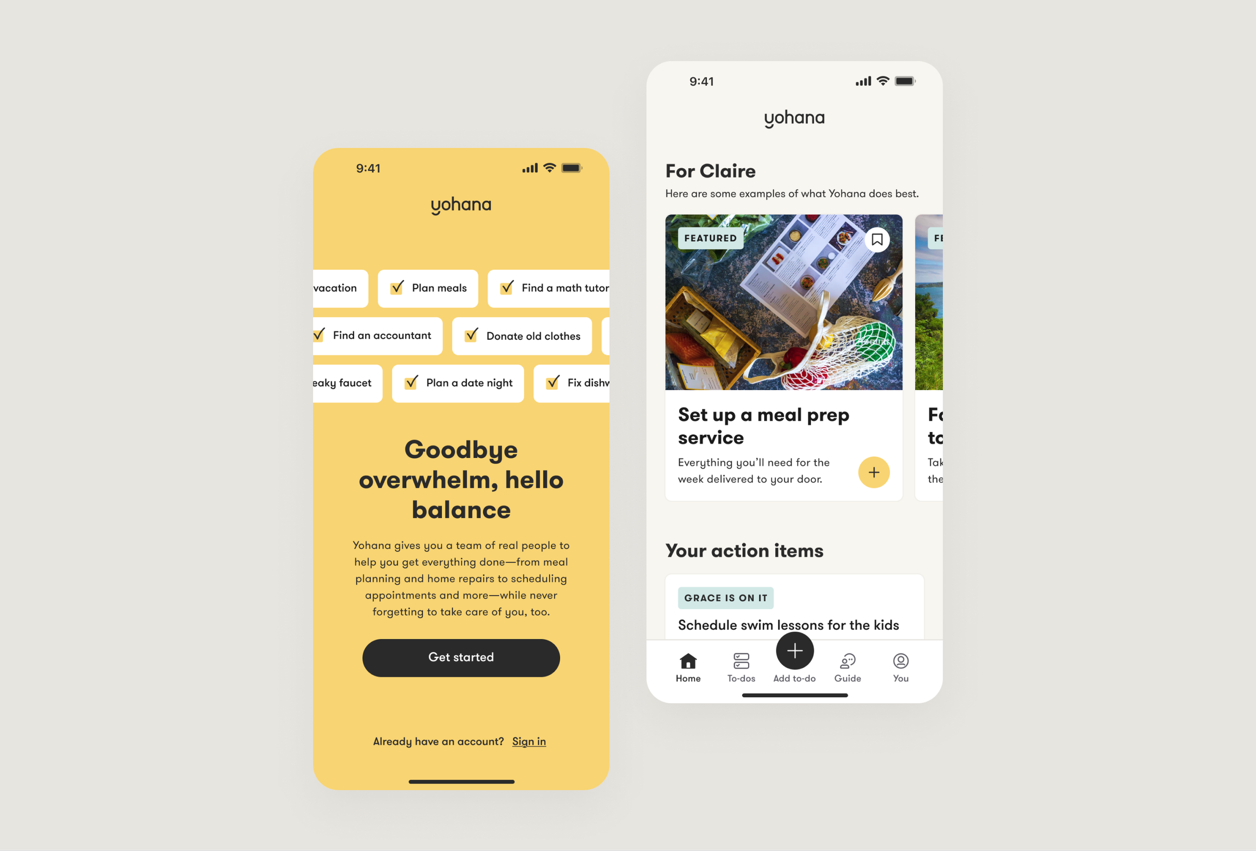
We worked closely with the Yohana team to re-design the core flow from onboarding to completing their first task for mobile and web user experiences. Central to our efforts was the creation of a comprehensive free app experience, aimed at educating users on the brand’s core offering. Our goal was to establish clear expectations regarding how Yohana can seamlessly integrate into their daily lives.
Feature discovery and definition
Based on a comprehensive audit of their service and existing app experience, our team identified key features and journeys where enhancements could yield the greatest user impact and drive engagement.
To know Yohana is to love Yohana, and together with their team, we re-designed their app with a renewed emphasis on inspiration and trust. Our goal was to effectively translate Yohana’s value proposition, remove user confusion and hesitation, and exemplify the product promise every step of the way.
A more intuitive user experience
With a plan in place, we set out implementing them through tangible product features and flows.
First, by decoupling the sign-up process from the subscription process, ensuring a streamlined sign-up experience for all users.
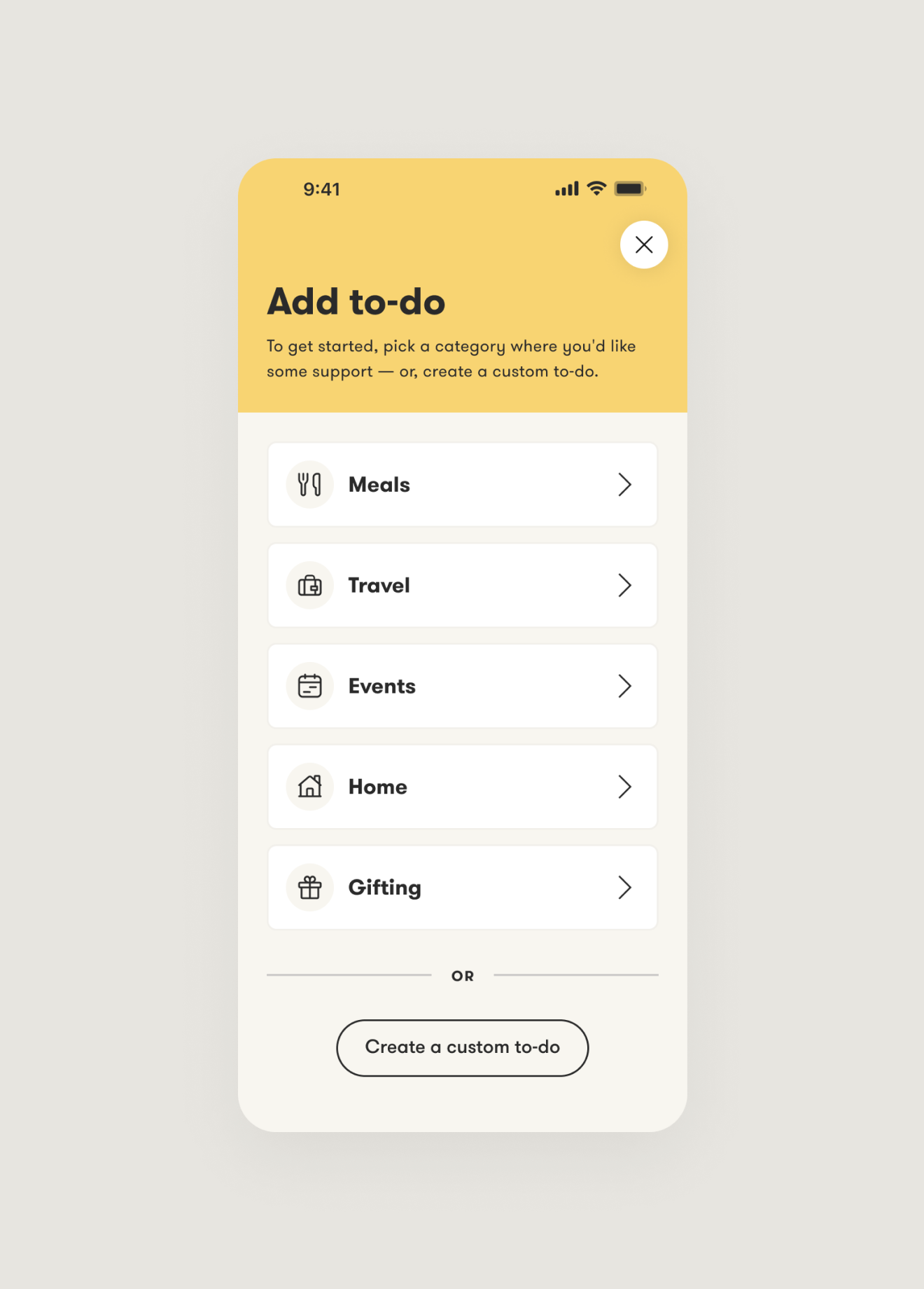
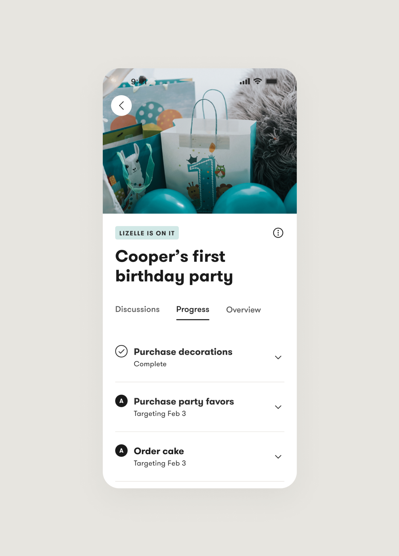
Next, by ensuring that product education and feature discovery are available when users need them most. With the goal to increase task creation and app engagement, we designed a step-by-step walkthrough for first time users and a new homepage that provides approachable and easy starting points.
Prototyping and testing our concepts
To confirm and improve our proposed features matched user needs and expectations, we conducted a usability study with both new and existing Yohana users.
Following the test, we applied our learnings to revise and improve the experience before development and launch.
Cohesion across surfaces
Our aim was to establish a consistent and unified look and feel across both the native mobile app and web application for Yohana, and in-line with Yohana’s new brand guidelines.
We carefully crafted design elements and visual components that seamlessly translated across surfaces. By maintaining consistent typography, color schemes, and layout structures, we ensured a cohesive user experience regardless of whether users accessed Yohana through their mobile devices or web browsers.
MORE PROJECTS
Oura
Enhancing how customers discover, learn and shop
Epic Games
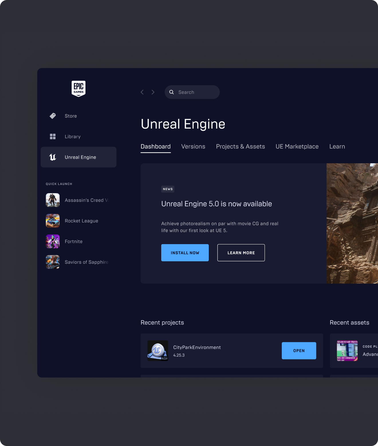
Designing a hub in the launcher for Creators
Giant Steps
Learning through gamification and retrieval practice
Lumen Learning
Enabling affordable digital courseware for all students


